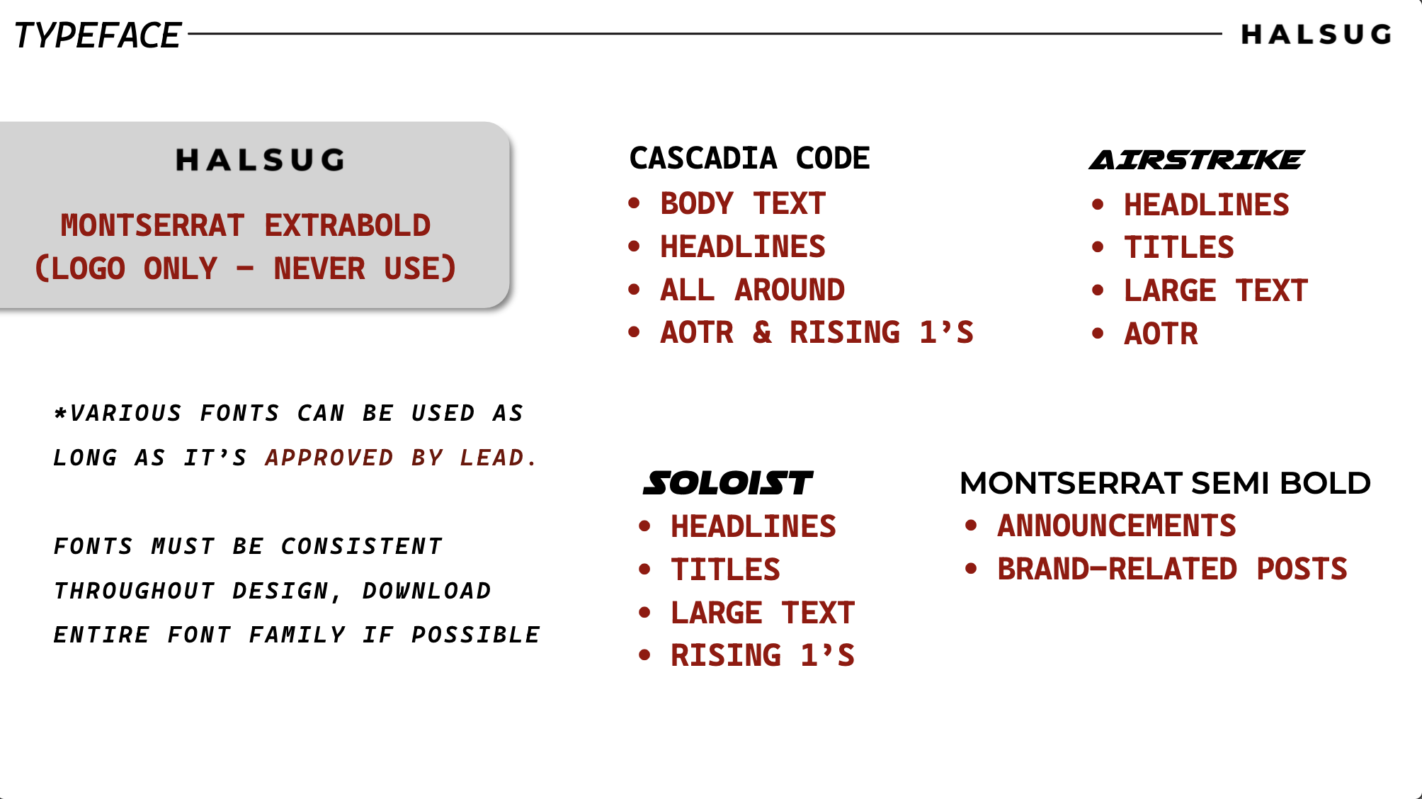
This project was a brand refresh initiative I led for HALSUG, where I was tasked with updating and expanding the visual identity of the company. With approval from HALSUG’s Editor in Chief and the brand’s founder, Kat Beron, I introduced new typefaces and accent colors to bring a more modern, cohesive feel to the brand while maintaining key elements of its original identity.
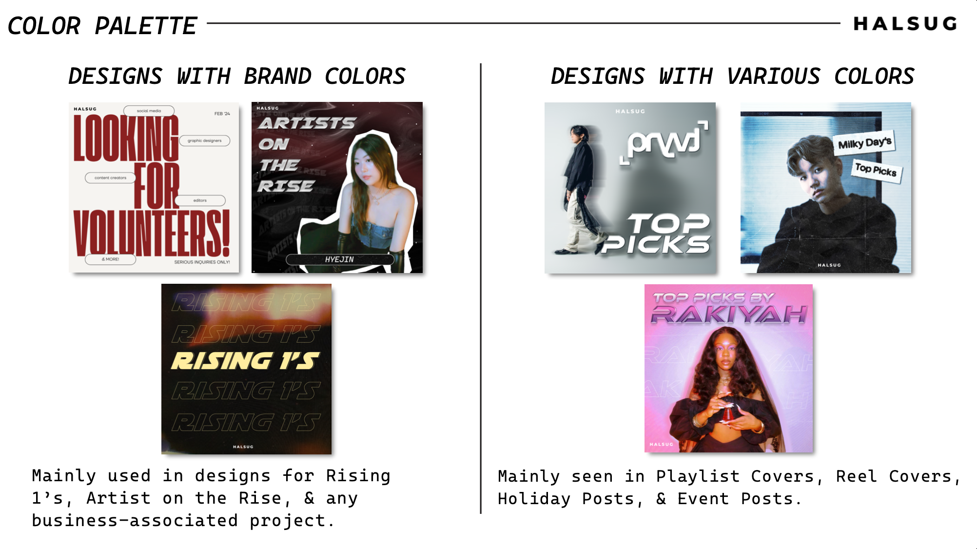
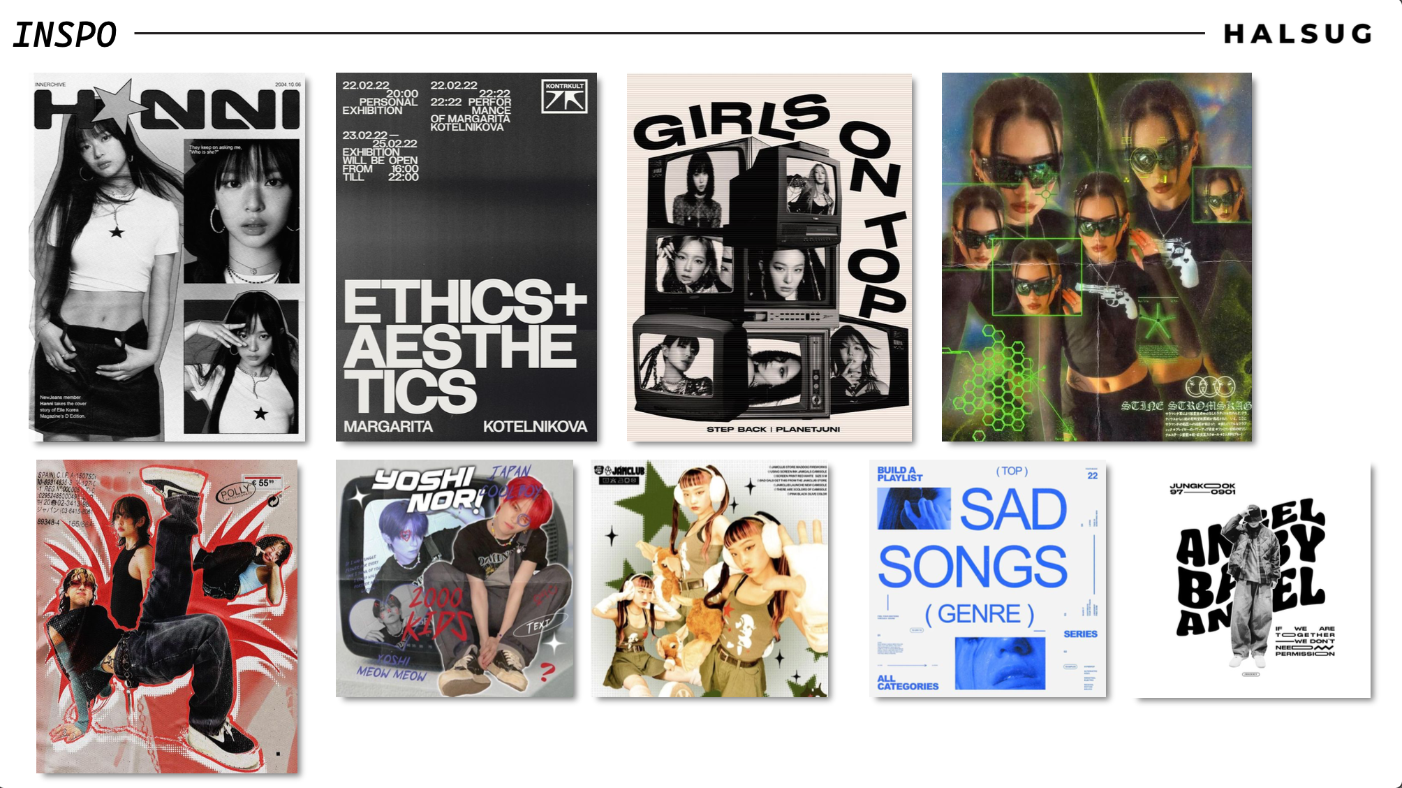
The deck included updated design applications using real HALSUG posts, showcasing how the refreshed visual language could be applied across digital content. I also curated a final moodboard with design inspiration to help guide the creative team moving forward.
Only select elements were carried over from the original branding, including the logo, two typefaces, and the brand’s three primary colors. The new design system was implemented in future posts, making this an impactful and approved evolution of HALSUG’s visual direction.
This project has been officially approved for portfolio use by the brand’s creator, Kat Beron.